Five Ways to Write Better Alt Text
September 27, 2020
It’s easy to write minimally-compliant alt text. Just stick anything at all in there and automated testing tools will be happy. But if you actually care about providing high-quality experiences for blind users (which you should), writing alt text is a lot more challenging.
Today, I’m sharing five tips that should make it a little easier—with practice—to write effective alt text that actually makes sense.
If you aren’t a web developer and just want to know how to write better alt text (e.g. for social media), you can skip over the code samples in this article. The rest of it still applies!
In this article:
- Don’t say “photo”, “image,” etc.
- Focus on the image’s purpose.
- Use
alt=""for decorative images. - Keep it brief.
- Don’t repeat yourself.
Don’t Say “Photo,” “Image,” Etc.
One of the most common mistakes I have seen is to start your alt text with something like “an image of”. This creates a worse experience for screen reader users because screen readers already announce images as such. For example, VoiceOver for macOS reads the alt text first, followed by the word “image.”
Take the following possible alt text for a picture of a cat:
Photo of a brown tabby cat curled up on the couch.
The readout from VoiceOver will be something like, “Photo of a brown tabby cat curled up on the couch, image.” While technically correct, announcing both “image” and “photo” is redundant and a worse user experience.
Instead, try something like this:
A brown tabby cat curled up on the couch.
Or, in your HTML:
<img src="myCuteCat.jpg" alt="A brown tabby cat curled up on the couch." />The readout would then be something like, “A brown tabby cat curled up on the couch, image.” Much better, don’t you think?
Since there is usually an exception to every rule, I would argue that it might be helpful to identify the type of image something is, when it is important to the meaning. For example, if you are sharing a digital illustration of your cat, it might be appropriate to say so in the alt text, as long as the fact that the image is an illustration is relevant to the point you trying to make.
Focus on the Image’s Purpose
When composing alt text, it can be tricky to know what to write! You might think you need to describe literally everything in the image, but that’s usually not the case.
Instead, consider what the purpose of the image is, in context.
Take the example of this photo of some knitting and a cup of coffee I tweeted the other day:
This was the content of my tweet:
Today’s up early, before work activity is knitting! I finished some short sleeves for a top and now I’m going to wind yarn for a hat.
P.S. I really miss travel. 😭
I added the following alt text to my image:
Two flat pieces of knitting in front of a full coffee mug. The mug is the Vancouver edition of the Starbucks ‘You Are Here’ collection.
In this case, my intent in sharing the image was to show off my knitting project and to convey that I miss travel. I chose the Vancouver mug that morning because it was from a place I had visited. I described the coffee mug in my alt text because it helped convey that I miss traveling.
Let’s consider another potential purpose for this image!
What if this was a promotional photo targetting knitters and advertising the hand-dyed yarn used in the project? The alt text might look something like this:
A stockinette knitting project worked using a mostly pink variegated colorway with blue, darker pink, and purple speckles distributed evenly.
Notice that I didn’t even mention the coffee mug because it has nothing to do with the photo’s purpose.
Icons
I want to call out icons specifically because I’ve seen their alt text done wrong many times, specifically when used as links.
Imagine that I have an image of a Twitter logo that I want to use as a link to my Twitter profile. You might think I should do something like this, where the image alt text is “Twitter logo”:
<a href="https://twitter.com/rleggos">
  <img src="twitterLogo.png" alt="Twitter logo" />
</a>
However, when a screen reader announces this, the readout will be something like “link, Twitter logo, image.” How is a blind user supposed to know where this link goes?
In a case like this, it is best to think about the alt text as link text. If I was making a text link to my Twitter profile, I wouldn’t write “Twitter logo”. Instead, I might write something like “my Twitter”.
So, better alt text might be “my Twitter”, as follows:
<a href="https://twitter.com/rleggos">
  <img src="twitterLogo.png" alt="my Twitter" />
</a>
The same principle applies if you are using icon fonts and labeling them with aria-label, but that goes beyond the scope of this article.
Use alt="" for Decorative Images
The header image at the top of this post is a good example of a decorative image. It does not add any meaning to this post and it isn’t necessary to understand this content. If it wasn’t there, it wouldn’t matter.
The best way to handle alt text for decorative images is to include the alt attribute, but leave it blank, as in the following:
<img src="decorativeImageFileName.png" alt="" />You might think you could just leave off the alt attribute altogether, but that would result in a worse experience for screen reader users. When the alt attribute is missing, most screen readers will read out the name of the image file. Users might be left wondering what they are missing.
Including this alt attribute, but leaving it blank, lets screen readers know that the image is decorative and should be skipped over when reading the page. A screen reader won’t tell the user anything about the image at all.
Keep it Brief
There is no technical limitation on the length of alt text. However, the generally accepted purpose of alt text is to provide a short description, so it’s best to keep it brief.
Since alt text is meant to be short, screen readers don’t allow users to pause alt text and resume it where they left off. This means long alt text descriptions are bad for usability.
There is no consensus for the optimal length of alt text, but a variety of online sources suggest lengths between 80 and 150 characters.
Deque, the creator of axe, one of today’s most widely used accessibility testing tools, recommends limiting alt text to about 150 characters. They suggest thinking of it like an old-school 140-character tweet, if you need help conceptualizing that length.
Use aria-describedby If You Need a Longer Description
Sometimes, it might not be possible to fully describe your image in a short alt text description. If this is the case, you can write a longer description elsewhere in the HTML and associate it with the image using aria-describedby.
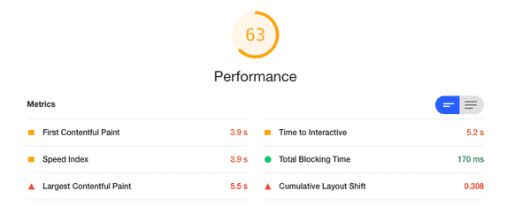
For a practical example of this, consider this screenshot I included in my WPCampus 2020 Online talk on website performance:
If I’m writing content that includes this screenshot and it’s important that folks can read all the text contained in the screenshot, I’m going to need some alternative text. However, I shouldn’t just shove everything into the alt attribute on the image because it will be too long. Instead, I might use an unordered list to convey the information and associate it with the image using aria-describedby. Here’s what that markup could look like:
<img
  src="performanceScoreScreenshot.png"
  alt="Results of a Lighthouse performance audit."
  aria-describedby="audit-results"
/>

<ul id="audit-results">
  <li>Overall score: 63 out of 100.</li>
  <li>First contentful paint: 3.9 seconds.</li>
  <li>Speed index: 3.9 seconds.</li>
  <li>Largest contentful paint: 5.5 seconds.</li>
  <li>Time to interactive: 5.2 seconds.</li>
  <li>Total blocking time: 170 milliseconds.</li>
  <li>Cumulative layout shift: 0.308.</li>
</ul>
Now, my audit-results list will be associated with my image and screen readers will read that list as an additional description, after announcing the “Results of a Lighthouse performance audit” alt text.
This solution is also visible to sighted users, of course. There are ways to visually hide content while keeping it available to screen readers, such as those described by The A11y Project in their article on hiding content.
However, in this particular case, I would recommend keeping the text description available to visual users. Plenty of users do things like zoom to view content, or use assistive technology to change the color and contrast levels of content to accomodate visual disabilities. To best serve these types of users, whenever you include an image with text on it, it is a great idea to include a text alternative that is visible to sighted users, too.
Important note: You might be tempted to use aria-labelledby instead, but don’t! Most screen readers give precedence to aria-labelledby over alt, meaning they will read aria-labelledby instead of the alt text, not in addition to it.
Don’t Repeat Yourself
This commonly cited programming advice is good for alt text, too.
Let’s revisit my knitting and coffee mug photo tweet from above.
Tweet text:
Today’s up early, before work activity is knitting! I finished some short sleeves for a top and now I’m going to wind yarn for a hat.
P.S. I really miss travel. 😭
Alt text:
Two flat pieces of knitting in front of a full coffee mug. The mug is the Vancouver edition of the Starbucks ‘You Are Here’ collection.
Notice that I did not describe the knitting in the alt text, other than saying that the knitting is flat (as opposed to being worked in the round—a distinction that will make sense to any knitters who might come across my tweet).
My tweet already says the project is a pair of short sleeves so there is no need to repeat that in the alt text. In fact, it would be a worse user experience if a screen reader announced that same information to the user twice.
Conclusion
Remember these five tips the next time you share an image online.
- Don’t say “photo”, “image,” etc.
- Focus on the image’s purpose.
- Use
alt=""for decorative images. - Keep it brief.
- Don’t repeat yourself.
Even if you’re just tweeting or writing an Instagram caption, not building a website, these tips apply. If we all practice writing quality alt text, we can create a more inclusive web together. ❤️
Further Reading
For more details and additional examples, check out the WebAIM article on alternative text.
For a little fun adding alt text to emojis, check out my article on How to Make Emojis Accessible in HTML.

